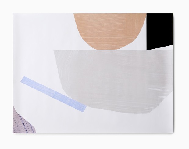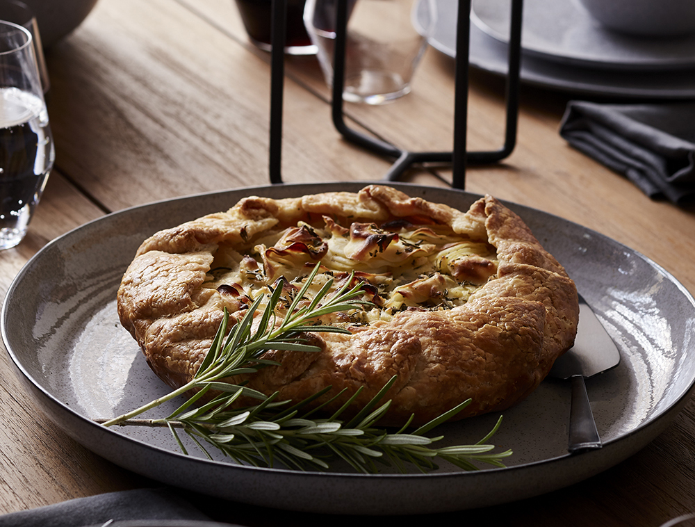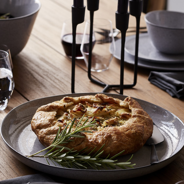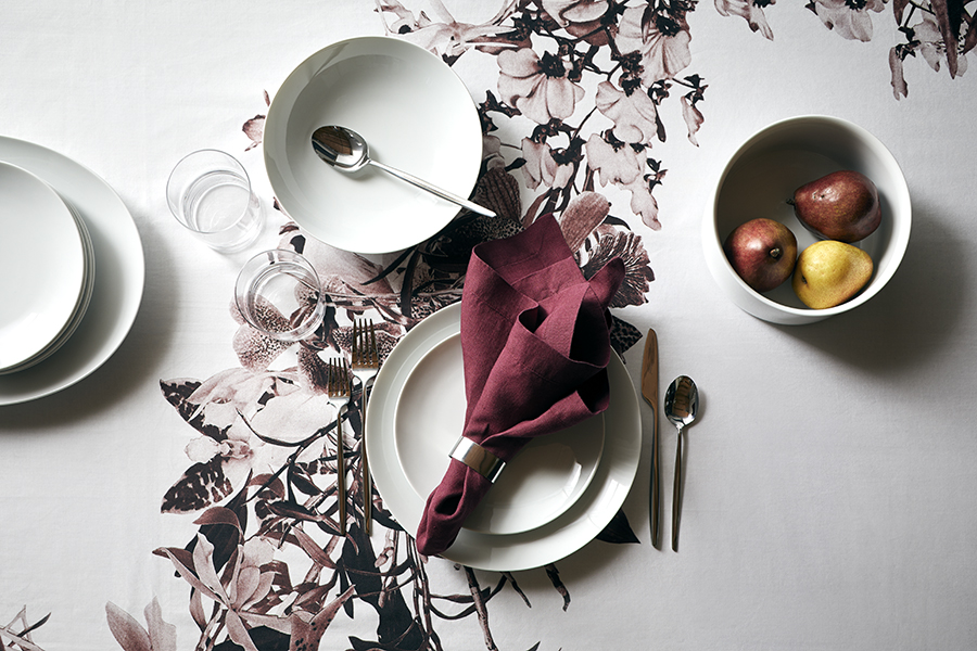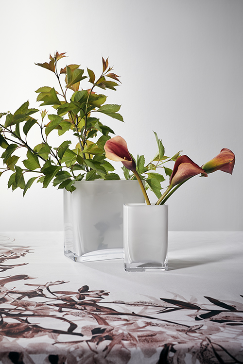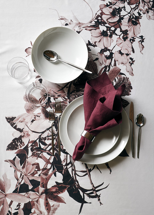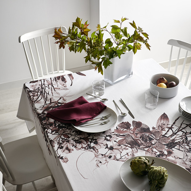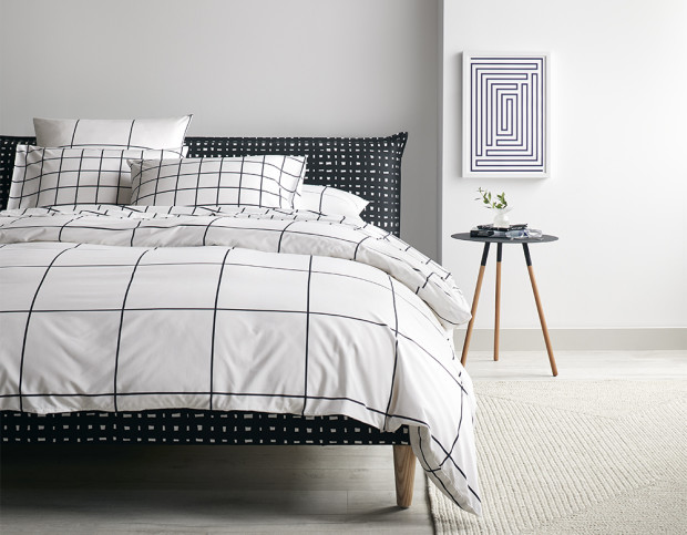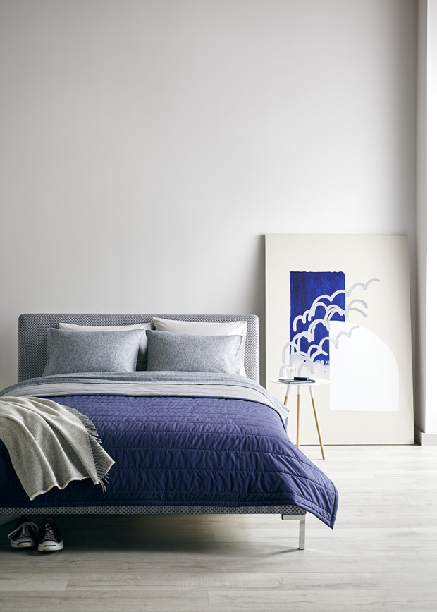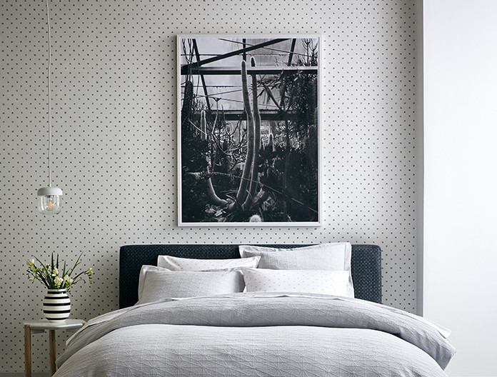
We at Unison counted ourselves lucky this year to be able to feature the striking photography of Debbie Carlos in our Fall 2017 catalog. This month’s #ArtinUnison highlights her photographs, along with a Q+A involving her artistic influences, favorite places to capture, and her true opinions on jellyfish.
Q: Your site talks about your quest to “capturing objects at their moments of greatest clarity” — do you have any particular environments you find work best for that?
A: I find that my senses are the most heightened when I’m traveling. Being in a new environment I’m hyper aware of everything going on around me, and I try to take it all in and capture as many moments as I can in my camera.
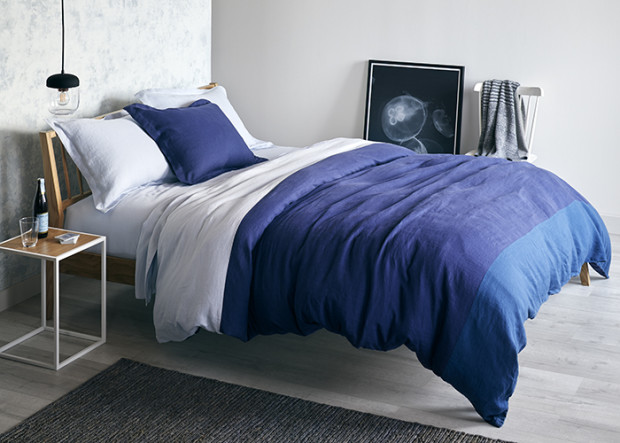
Q: One of the photographs we featured in our fall catalog was of jellyfish — what was striking about that moment to you that you wanted to capture it?
A: It’s hard not to be enthralled by the strange forms of jellyfish. They are blobby creatures, ethereal & ghostlike in the way they are lit at the aquarium, and sort of elegant in the way they float through the water.
Q: Who are some of your greatest influences?
A: Rinko Kawauchi and Uta Barth have always been a huge influence on my art. Their work always strikes an emotional chord in me.
I remember going to a William Eggleston a number of years ago at the Art Institute of Chicago and felt like it was so validating.
More recently, I have become a huge fan Teju Cole’s words and images. His instagram is definitely worth a follow and his book of photographs and essays, ‘Blind Spot’ is wonderful.
Q: What is your favorite place to photograph?
A: Japan never fails to be pure eye candy to me.
Q: How does modernism reflect itself in your work (if you think it does)?
A: I do think that there is a strong modernist bent to my work, not only aesthetically but conceptually. One of the things that has always stuck with me was Eames’ mantra “Create the best for the most for the least”. I loved how democratic that idea is and was very much a part of modernist concepts of accessibility to design. Art should not just for those who have the money to afford it, but should be approachable to many. In terms of my photographic work, this is the reason why I re-appropriated engineering printers to produce many of my images. I was re-appropriating a type of utilitarian printing for fine art and thereby creating, on one hand, it’s own unique aesthetic but on the other, casual and approachable everyday art for everyone.
You can find more of Debbie Carlos’s work on her site at Debbie Carlos Studio, or on her Instagram @debbiecarlos.