blog-banner

From an Artist’s Studio to Your Table: Floral Burst Tablecloth

A Q&A With Designer Stephen Eichhorn

Previously, we together dreamed up Aerial, a mesmerizing, earthy graphic based on a collage of canyons. For this summer, we’re going full bloom with Floral Burst, a fresh, bright tablecloth based on one of Stephen’s botanically inspired pieces.

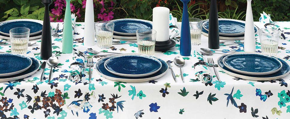
The original Floral Burst collage is actually many colors on a black background, but by inverting all colors it developed into a beautiful range of blues, giving the appearance of flowers floating on water. Producing the tablecloth has been a year in the making to find just the right printer that could retain all colors and textures. Turns out, digital printing was the way to go and finally one of our Portuguese vendors had perfected it on quality fabric that withstood many wash tests.

floral-table
Floral Burst Tablecloths

It’s the perfect time to get to know this talented artist and discover this project, which has us completely excited. Read our Q&A with Stephen below!

Unison: We loved working with you on Floral Burst. While it took a year to get the printing solidified, the creative process seemed to come about rather organically.

Stephen: Yes, this collaboration was an extension of our previous Aerial work. The floral burst pattern was taken from a relatively small collage that {Unison founders} Robert and Alicia further mediated. That’s been one of the joys of working with Unison – – the re-contextualization of existing work and the fact that we are typically, if not always, on the same page. In fact, the design process is pretty hands off on my end and is more about bouncing product ideas back and forth.

Unison: You often explore nature and organic shapes in your work. Why are you drawn to that theme and forms?

Stephen: I’ve been working on and slowly expanding my use of nature and organic shapes since I started making collage 7-8 years ago. I was initially drawn to the imagery because of its form and structure. Using found imagery and tracking down different collage components has led to other endeavors. For example, I came across orchids (that I’ve used in my studio practice) while hunting for floral imagery.

floral-burst-inspo-final

Unison: This project is different than Aerial (which looked almost like a photo) because it’s more punchy and graphic in nature. How do you think these works differ and what in your creative process made each unique?

Stephen: They are both born from the same formal exploration of manipulating photographic material, but the imagery and the rules I assign to making them drives unique outcomes. Each piece is the result of making simple gestures with collage — the Floral Burst coming from a mirroring of form in response to the kind of cosmic strata of flowers. The Aerial piece came from a more simplistic stacking of pattern, therefore making a new pattern.

comparison

Unison: What do you imagine as the ideal setting for the Floral Burst tablecloth?

Stephen: I like the idea of the tablecloth being used in a more informal context — outside at a cookout or in a mellow picnic setting.

Unison: How do you keep busy creatively beyond your collaborations with Unison?

Stephen: I am a working, self-employed artist so I am in the studio most days. Right now my time there is split between commissions (for private collections as well as work for several upcoming magazine features), developing new work and starting to make sculpture again.

Thanks, Stephen! We can’t wait to see what’s next from you. And, heads up to all you Unison shoppers: You can snap up the Floral Burst tablecloth online or in the Unison store.


Don’t forget to follow Stephen here:
Online:
http://www.stepheneichhorn.com

Blog:
http://stepheneichhorn.tumblr.com

Instagram:
https://instagram.com/stepheneichhorn

black_blog_feature

Black Is the New Black

Modern design is all about meaning. It’s where aesthetics meet implications, where the ultra-chic collides with the culture it inhabits.

Biobu Black Dinnerware

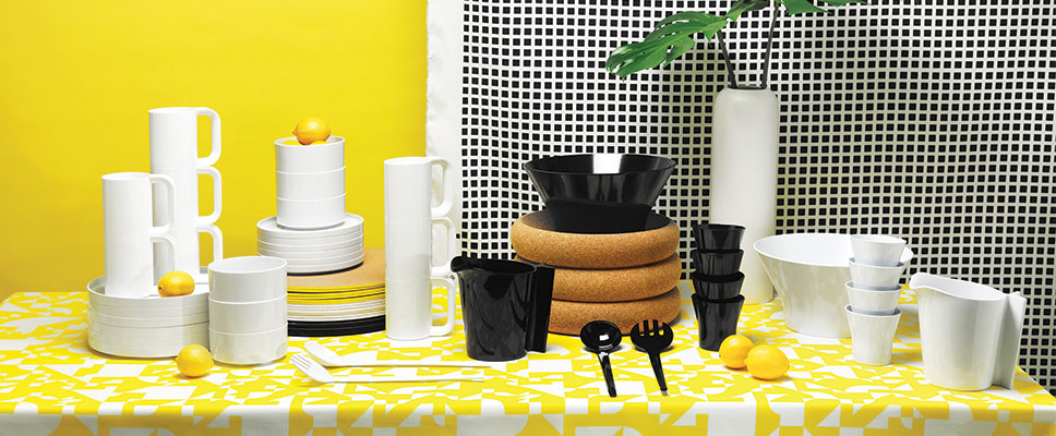
Take the latest color trend we’ve been watching (and embracing) since early this year: black. More dynamic and moody than the sugary tones of recent years, black has suddenly taken the interior world by storm.

Harvest Black Pillow

But why the dramatic turn toward this bold-and-dark classic? Perhaps it’s a reflection of our global situation—of the tensions, conflicts, and disasters that seem to define our world more each day. Or perhaps it’s a reaction to all this—a deeper, richer, and more comforting palette to shelter a home’s inhabitants from the fast-evolving complexities of our time.

Koppel Black Bowl
Koppel Black Bowl

Whatever your reason for choosing black this season, you can amp up the safe-haven ambiance in myriad ways: black hard goods, walls, tables, chairs, shelves, and kitchen fittings; black or dark-toned soft furniture, textiles, and rugs; and heavy-textured materials like velvet, plush, wool, and suede to compliment black’s weight.

Grid Knit Blanket
Grid Knit Blanket

The result: a deeper visual presentation that brings tough and cool together for a dramatic punch.

Møller Melamine Salad Sets

For starters, try revving up your white-hot summer with some of our best suggestions for beautiful black:

Koppel Black Pitcher
Tango Black Knit Pillow
Sky Black Planter
Sky Black Planter
Epicurean Black Sandwich Board
Stitch Black Bedding
Koppel Melamine Cups
Grid Black Knit Pillow
Cork Black Placemats
Sailor Black Outdoor Pillow
Butler Black Watering Can
Ceramic-Group

A Ceramics Story

This season, we are launching a striking variety of standout ceramics. Each piece makes a bold enough statement to stand on its own, but the collection still made us want to know more. So we cornered founding designer (and my husband) Robert Segal for some insight into choosing, using, and loving this new selection of offerings.

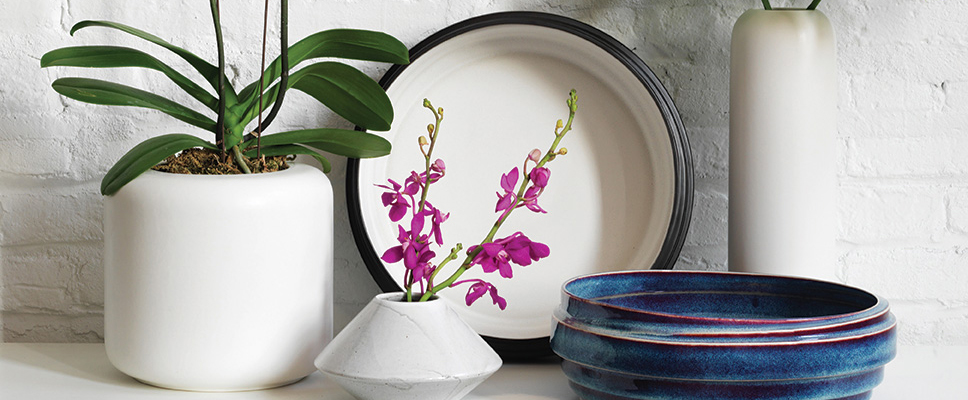
Modern Ceramics Pieces

Alicia: Why are you introducing a new ceramic line?

Robert: We feel ceramics complement our core line of bedding, throw pillows, and table linens. They merge in any room of the home, and we want to offer a selection from planters to dinner plates, to capture the unique perspective of our modern aesthetic.  Having done one-of-a-kind and smaller runs with designers abroad and local, we’ve come to love what can be created with the material.

Orbit Vases 2

Alicia: What is it about ceramic(s) that draws you in general?

Robert: The sculptural quality and material. And the fact that glazes are so similar to printing, yet more variation can occur.  I also find the contrast between ceramics and textiles appealing: hard and soft, cold and warm. It’s an interesting dichotomy.

Luna Plates

Alicia: What about the factories you worked with to make these? Why Portugal?

Robert: We have been producing our bedding collection in Portugal since 2006, so it was very accessible for us and easy to meet in person. Having known the quality from Portugal, I was excited to find various ceramic factories offering different ranges and technique. The collection reflects this, with some vases and plates hand made with reactive glazes, while others have been done with slip casting – more minimal and industrial. As we became familiar with new materials and design processes, I was taken back to the excitement of working through this process with textiles.

Alicia: The line is a mix of dinnerware, vases, and centerpieces. Is there one from the collection that you like best?

Strata Black Centerpiece Bowl

Robert: Perhaps the Strata Black Centerpiece Bowl. I love the contrast between interior and exterior, along with the dimension the material creates. It feels very solid and industrial, even tough it’s created from such a fragile material.

Alicia: What’s next in new products that you helped design and develop?

Robert: I’m looking to expand our range of ceramics for the Fall collection, with more texture and pattern involved. I’m also excited about using new colors with existing shapes, playing with the ways color can change the feel of an object.

IMG_9499

Manual Coffeemaker Launch Recap

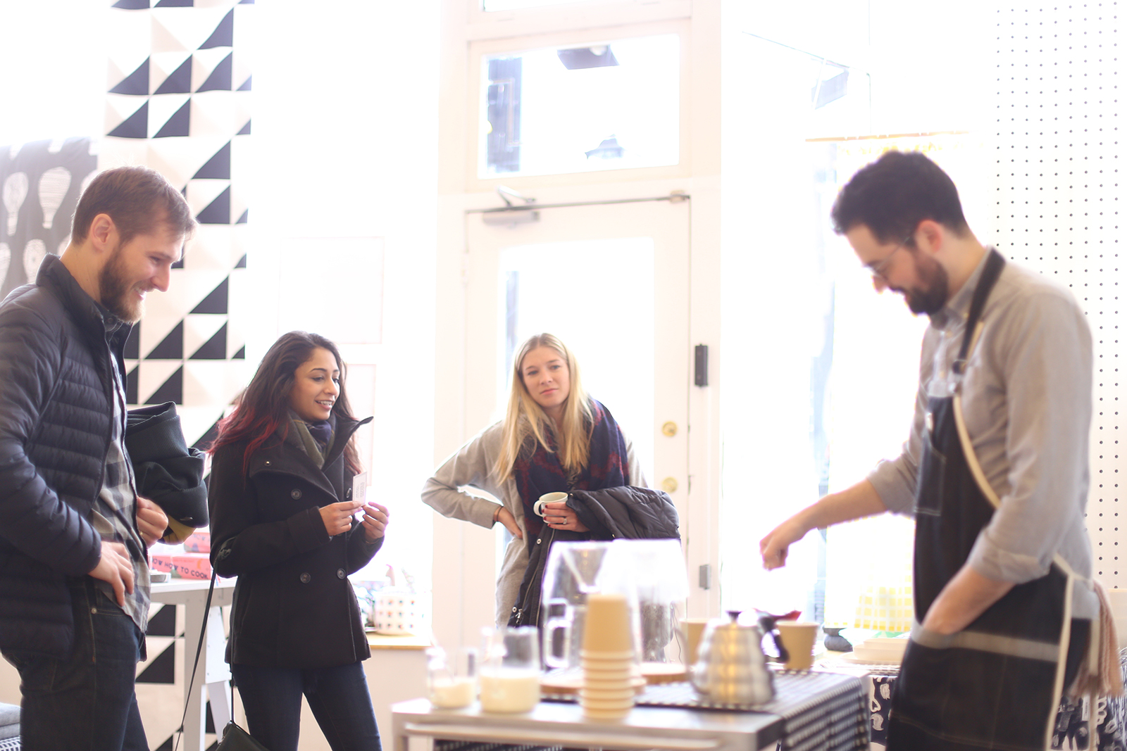
Just two weeks ago we launched the beautiful new coffeemaker from Manual at our Chicago store, attended by the creator Craighton Berman and a round of intrigued customers and coffee tasters. Craighton is the designer and producer of this amazing line Manual, and also an artist and professor here in Chicago. Manual’s goal is to  produce not only aesthetically beautiful products, but also ones that ask the user to slow down while making food.

IMG_9311IMG_9499

As he puts it: “We think the effort of preparing food is just as pleasurable as the food itself. We think there’s pride in making something yourself. We just aren’t all that impressed with gratuitous features. When it comes to food—we’d rather take it slow.”.

IMG_9439IMG_9481IMG_9208

Craighton demonstrated the process of the Manual Coffeemaker (truly easy) and how to pour the hot water correctly to achieve the coffee bloom which is an important piece in order to extract the flavors from the coffee. The coffee used was from Gaslight Coffeeroasters, also here in Chicago. We are so thrilled to be offering this gorgeous coffeemaker in our store and now online. As for Craighton:

“I’m thrilled to be partnered with Unison as one of the first retailers to carry the Manual Coffeemaker Nº1—they truly understand how to bring together an amazing collection of modern home goods that strike a balance between function and form. I’m honored to be among so many objects that I appreciate (and desire).”

IMG_9419


Geometry-in-Modern-Design

Modern Design 102: Geometry

In continuing our exploration of modern design’s key characteristics, we land squarely on the topic of geometry.

Where traditional interiors rely on heavy texture and ornamental flourishes, the modern movement looks to clean, straight lines for its aesthetic building blocks.

The Building Blocks of Modern Design Represented by Blockitecture Blocks

Let’s take a closer look:

Back to Basics

To help achieve its hallmark of breathtaking simplicity, modern design relies, in large part, on the sharp and spare lines of its architecture, furnishings, accessories, patterns, and so on. But how did this passion for clean geometry evolve?

Modern style grew from a desire to bring function into lockstep with form, which meant setting aside unnecessary decoration in favor of crisp lines.

In the early part of the 20th century, as industrialization swept the globe, the modern movement embraced the functionalism and new technology of its time. In light of the increasingly machine-driven global culture, much art and design in fact began to reflect the aesthetics and utility of machines themselves.

Modern Geometric Poofs

In light of all this, simple geometry quickly came to center stage. Economical, adaptable, and efficient to construct, geometric forms became a defining characteristic of the modern aesthetic—and left an endless field of play available to those of us who would embrace modern design long into the future.

Making Space for Strong Geometry

When applied decoration went out the window, new materials stepped in, and creative expression turned to a streamlined, almost futuristic look. Today, modern interiors rely on strong edges, simple curves, and geometric angles as much as ever.

At the same time, industrial materials like chrome, concrete, glass, stainless steel, and other polished elements dominate the modern interior scene—materials that seem to lend themselves naturally to strong geometric forms.

Screen Shot 2015-03-05 at 8.40.55 PM

In fact, at its core, modern style is a form of extreme precision. So in many cases, the movement strives to illustrate the simplest forms: squares, rectangles, or rounds—all heightened to a new meaning and elegance by virtue of careful placement and emphasis.

Which brings us to the all-important factor of space. Much inspiration for modern design has come from the clean, geometric features of the Japanese style. In Japanese design, space is not seen as an emptiness or lack of something. On the contrary, it is considered an important design element.

Hip to Be Square at Home

You can establish a sense of structured, clean geometry in any interior space. Start with the bare bones of the room.

A Clean and Crip Modern Bedroom

For flooring, walls, or other surfaces, consider clean white, oversized tiles with rectified edges, or wood floors sanded down to minimize the grain.

To highlight the natural geometric lines of a room, skip moldings or trim around windows, doors, and walls.

A Modern Room with No Molding

Think organization from the outset, but try setting bookcases and shelving into the walls, rather than letting storage elements protrude into the space.

Now for furniture. Clean and spare is the name of the game here—but don’t think that this means boring. More often than not, modern furnishings can best be described as bold, striking, and often flat-out fun. Look for clean lines at every turn, and let yourself be picky.

A Moder and Crisp Geometric Tablescape

Finally, accessorize with flair and drama. This is a great place to begin playing with asymmetry—an effect that’s achieved by combining dissimilar objects that have equal visual weight or eye attraction. Today, asymmetrical balance is one of the defining characteristics of a modern, geometrically minded space.

While more casual in feeling, asymmetry can be quite difficult to achieve. So think about starting small: on your coffee table, balance an eye-catching, radial metal bowl with a neat, straight-lined stack of boldly colored books. Whatever your attempts, it’s worth experimenting until you nail it. Asymmetry suggests movement and can lead to very lively interiors.

Screen Shot 2015-03-05 at 8.35.48 PM

When you’ve achieved new heights of gorgeous geometry, post your own tips in the comments below, or share your pics with us by mentioning @UnisonHome when you share your style on Instagram. We love to see how you’re incorporating the essentials of modern design into your own interior spaces.