L1000066_2

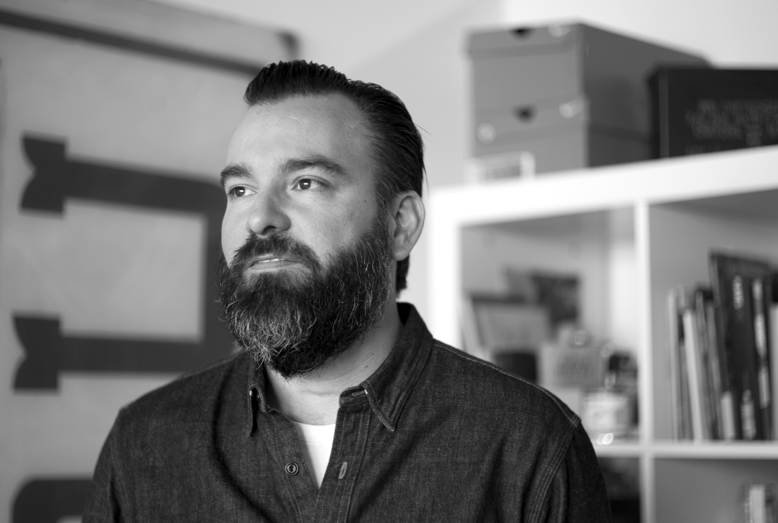
Cody Hudson for Unison

In Chicago when you mention the name Cody Hudson your eyes light up because you love what he does – which is a lot: art, graphics, street art, fashion, restaurants. Wait, restaurants? Yes. And although Cody is a artist, design extraordinaire and serial entrepreneur, he certainly is a truly humble, down to earth, soft spoken man. Our first collaboration was really as the provider of chambray linens at Longman&Eagle inn where as they put it so perfectly, “aesthetics, comfort and function are manifest throughout”. We also had the pleasure of shooting our fall 2010 collection at the inn and splurging on memorable lunches at L&E. During one conversation with him he passed along a small book of postcards (which we coveted) and started to dream of how we might collaborate. The result was the perfect mix of lighthearted illustration and modern simplicity: the Anchors bedding collection for babies, kids and adults too. Read on for more story behind Anchors and a bit of Cody-ology.


You’ve worked with Burton on designing apparel and boards (correct?), but never home design. What was this experience like for you?

I’ve worked with a lot of clothing companies on patterns in the past (Burton Snowboards, Nike, Stussy, Sixpack France, etc), but I would design the patterns to be printed on the jackets not the actual jacket themselves. Housewares is always something I’ve been interested in as I’m a general fan of design so I thought it would be an interesting thing to try. Also I have a 2.5 year old daughter at home so the idea of working on something specific for kids is a fun project for me at this stage in my life.

Initially, Anchors were in a book of postcards you put out. How did that idea originally come about and what was the inspiration?

It was from a page of random doodles, I started to like how they looked so I thought I’d keep drawings pages of them and see how they all looked together. It then ended up in a book of postcards published by Concrete Hermit in the UK and also I did a t shirt design with a large anchor on it for my friends brand Quiet Life. It kind of went from there and turned into this collaboration with Unison.

Can you talk a little bit about your overall creative process? Do things happen fast and furiously, or are you more methodical?

It really depends on the project, stuff like this that is more sketch based usually happens late at night in my sketchbook. These started as just fun quick doodles so it was never meant to really become anything but a fun idea.

Would you say there is any “signature” of your work? An aesthetic that surfaces time and time again, or a theme or underlying meaning?

My work tends to be more hand done and shape based at times, a little rougher as well and not always so polished. Also I tend to work in more simplified color palettes so you could call some of that out as my signature styles.

What draws you to the seafaring theme? Do you see anchors as a new trend (like birds and owls)?

When I originally drew these anchors it was probably 4 years ago, but you are definitely seeing lots of nautical inspired stuff out there in the design world so now was probably a good time to release the bedding.

Unison first aimed to have this bedding be for kids and baby but decided to take it into the adult market, too. Did you aim for it to have an ageless feel.

In my head it’s still mainly for kids but I think there is some playful crossover that happens and adults can use it as well.

Being in the restaurant/hospitality biz and design/art biz, how do you see these two worlds confluence? Any unifying ties?

Since I work with a group of people on my restaurant projects my part of that collaboration is still focusing on aesthetics and design. So at the end of the day I am still working with design, it’s just the look and feel of a restaurant and all the materials around it (menus, logo, etc) instead of an album cover or t shirt design.

You have the Anchor Bedding at the Inn at Longman & Eagle. Anything else to add about the guestroom design/décor and how this bedding fits into it.

The Anchors bedding is not actually in the rooms currently although that would be fun to try it out up there. We do use Unison products for all the beds though and it is that initial meeting that put us in touch and kept us in contact and made this collaboration possible. We also strive to use local products in the rooms when possible as well as working with local artists for most of the artwork in all of the rooms at the inn.

Now that you’ve delved into home design, anything next in that arena for you?

I’m open. More housewares would be fun. I’d love to design a collection of dishes or glassware. A collection of pottery designs would be a really interesting project. Every designer dreams of putting some artwork on the side of an airplane. So who knows?

alexfuller_portrait1

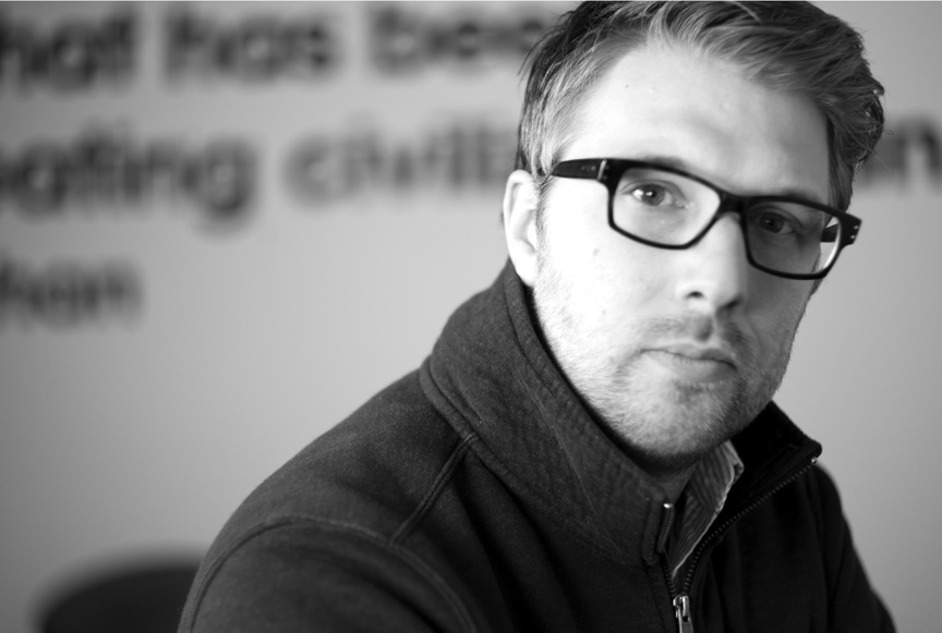
Alex Fuller for Unison

We fell for Alex’s design sensibilities a couple years ago when we picked up his self published book The Incredible Journey That Is Consciousness by 5×7. The pages are and endless stream of glorious shapes, but we knew there was more to it than just that. Turns out Alex is inspired by the principles of the Bauhaus (us too) and he just loves the geometry of shapes (us too). So beyond his full time job as a Design Director at Leo Burnett, and family member of  The Post Family, he turned out some rad patterns for us. Read on to learn all about what’s in Alex’s head and check out the results of our fabulous new bedding collection Shapes, for adults, kids and babies.

Your book, The Incredible Journey That is Consciousness, along with a poster, inspired the Geometry/Shapes poster you did for Unison. Which eventually led to bedding. How did the book originally come about and what was the inspiration?

The inspiration for the book came from Bauhaus design theory where the 3 primary colors are conceptually paired with the 3 primary shapes. We took that foundation and freely composed spreads.

This is the first time you’ve worked on a home design collaboration. What was the process like for you?

Amazing. I created a lot of little parameters for myself to keep the exploration on track. It helped to limit the amount of scaling and making sure to lock shapes to a strict grid. I made about 50 different patterns and compositions before finding the right density. I also learned a lot about the production process and how to get the most out of a sheet of printed fabric.

Can you talk a little bit about your overall creative process? Do things happen fast and furiously, or are you more methodical?

I came into this project with a strong vision based on the evolution of the book. I knew the building blocks, just needed to explore a spectrum of densities and color permutations based on seasonal trends.

I always start with a creative challenge then build a strong point of view of how to execute against that with research and exploration. By the time I start actually producing executions it’s pretty well sorted and quick to get to that end goal. Think more, design less.

Would you say there is any “signature” of your work? An aesthetic that surfaces time and time again, or a theme or underlying meaning?

I believe my aesthetics are a byproduct of my reductive process. I’m always trying to get to the heart of the challenge and expose that raw purpose.

What draws you to shapes and geometry? And, further to that, would you have any comments on how your shapes designs could be seen as “random yet rhythmic”?

I am drawn to the fundamental building blocks of our visual language. It’s a universal language and full of meaning. Take a triangle for instance. Facing north it represents a male symbol, south a female symbol. Add the color pink and it represents a movement around sexual orientation. Add the color red, it’s Bass beer. It’s also the strongest architectural form. I feel like I could spend a life time learning shapes and colors.

Unison first aimed to have this bedding be for kids and baby but decided to take it into the adult market, too. Did you aim for it to have an ageless feel?

My hope is that by using the building blocks of primary geometry I can design timeless compositions and color can shift audience appeal. The subtle light gray works for an older audience and the bright pastels more for the youngsters.

Now that you’ve delved into home design, anything next in that arena for you?

I am hoping to continue producing more patterned surface designs and extend into furniture and product design.

L1000082PS

Behind The Scenes – Spring/Summer Catalog Shoot

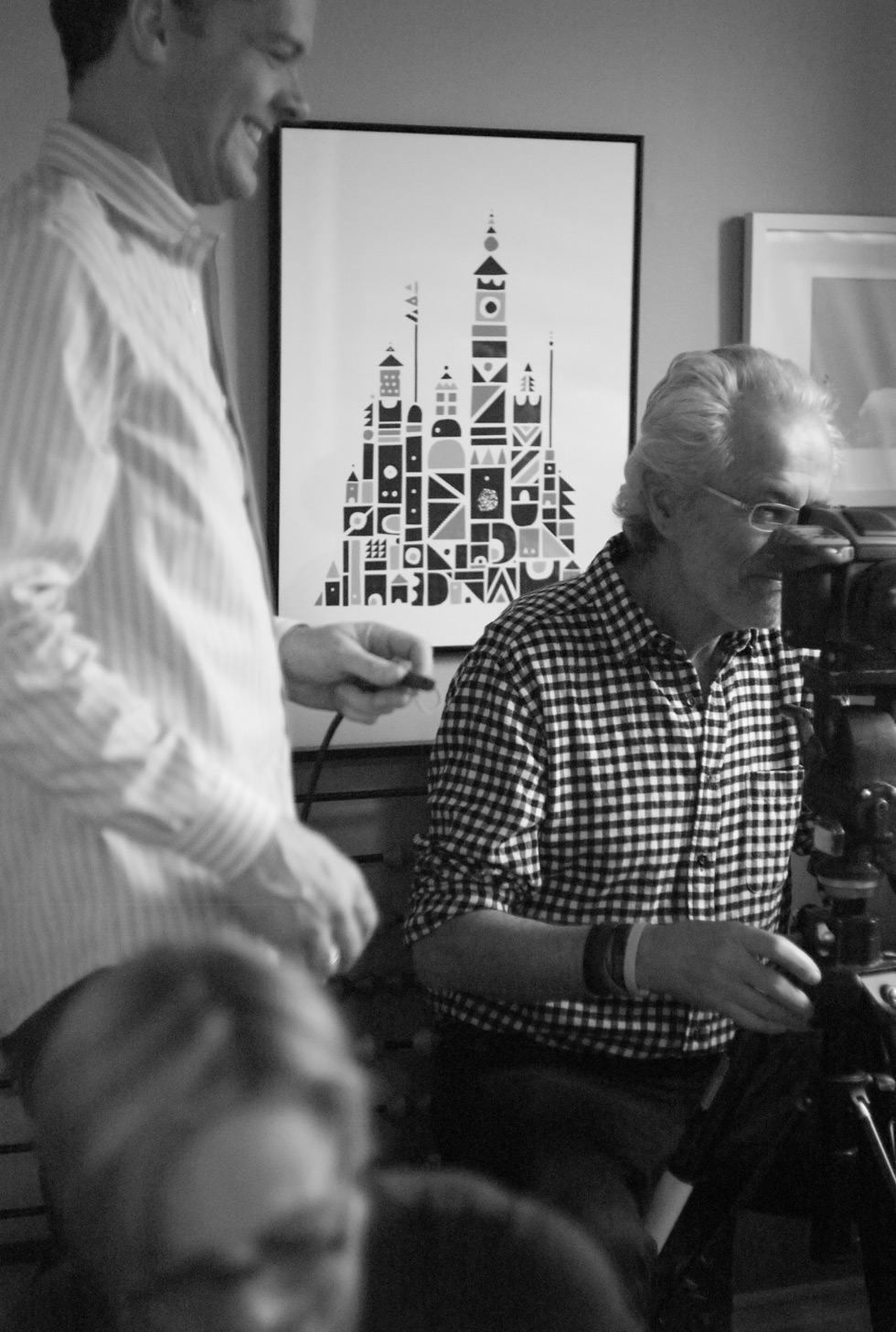
It’s hard to believe that another photo shoot has come and gone! This one was especially fun. Maybe it was because we were shooting on Valentines Day, or because it was Robert’s birthday, or because our little buddy, Dignan, was a natural in front of the camera, or because Jena + Joe were amazing hosts and made us a Valentine’s/Birthday cake for lunch. Whatever the case may have been, we had our stand-up team in place and our new product prepped for the lime light. Thanks to Francois Robert, Jane Gittings Robert, Bruce Bever, Wendy Petrosky, Jena+Joe of Penelopes, plus our lovely friend, Lyra Jakabhazy, who took all these fantastic behind-the-scenes photos.

Our catalog is on press as we speak. Look for it in your mailboxes at the end of April. If you’re not on our list, sign up for one here!

The Art&Craft of Hillery Sproatt

Here at Unison we have the great fortune of having an incredible craft talent on board, Hillery Sproatt. She has been using her hands to create some of the most intricate and finely made dolls and mobiles you have ever laid eyes upon. Our collaboration with Hillery started last summer with the idea of using scrap fabrics from our locally made pillow cases and napkins to inspire a mini line of cheerful dolls and animal mobiles. Each doll’s face, hair and details are all hand embroidered, as are the horse’s saddles on each mobile.

Even though Hillery is super busy as our domestic production coordinator, she still has time to work on her many projects. Right now she is starting work in weaving, miniatures that she can take with her on her commute – genius! Here’s a glimpse of a current piece, and more on her site.

mail_image_preview-2

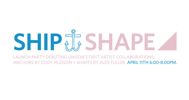
SHIP / SHAPE LAUNCH PARTY

Come to the Unison Studio+Store for an event debuting our first artist collaborations: ANCHORS by Cody Hudson + SHAPES by Alex Fuller. Shop the seafaring-inspired and confetti-colored bedding, pillows and posters at 20% off during the event. Meet the designers over drinks and lite fare.

APRIL 11th 6:00-8:00pm at Unison / 2000 W Fulton St, F-109


Candle Columns by 2nd Shift featured in The Guardian, UK.

Brits have good taste. Will Taylor, Market Editor for Sweet Paul and The Simple Things magazine, selected our Candle Columns by Ohio-based design atelier, 2nd Shift, to be included in a curated selection of housewares for The Simple Things Magazine. This selection got play in The Guardian on line. Nice! We got a phone order from England right away for a set. Yep! Get ’em before they sell out to the Brits!