LVL3, an exhibition space in Chicago, recently featured Unison in it’s Spotlight series. We were delighted to speak with them about our products, inspiration, Chicago, and more. To read the article, click here
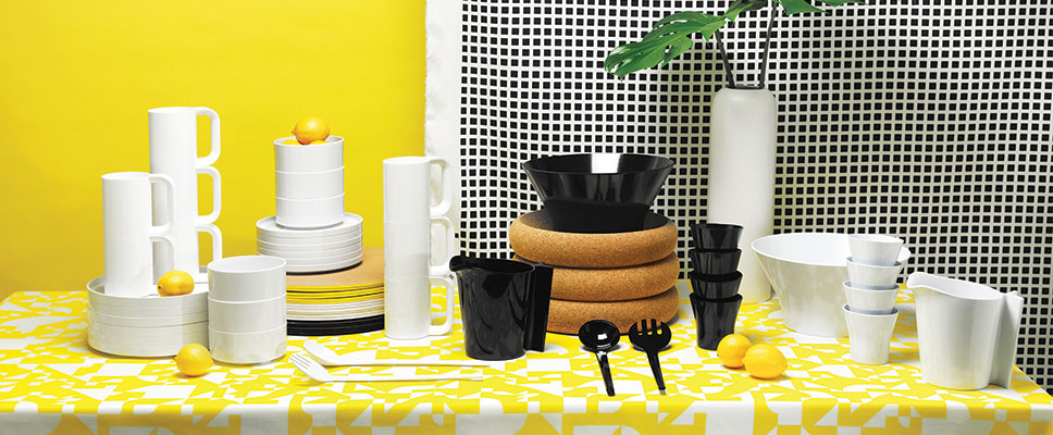

LVL3, an exhibition space in Chicago, recently featured Unison in it’s Spotlight series. We were delighted to speak with them about our products, inspiration, Chicago, and more. To read the article, click here
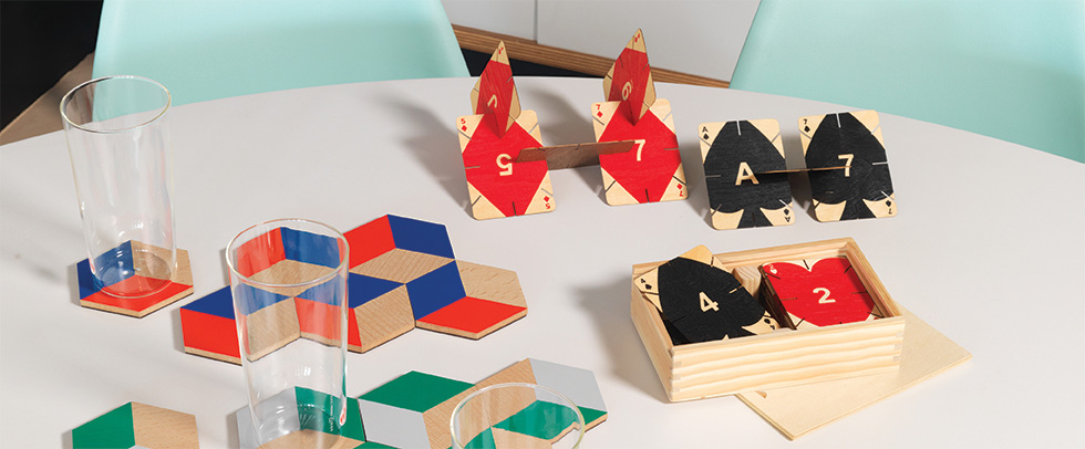
We were thrilled to see our Areaware Plywood Playing Cards in a Chicago Tribune piece last month. They were in high demand over the holidays and now they’re now back in stock!
Simplicity. Even the word itself is beautiful – and rich in fresh, bright, and positive connotation.
As a company that embraces and purveys the modern, we live and breathe simplicity. Not only because it appeals to every clean-loving bone in our modern-loving bodies, but because it’s at the core of the design philosophy we represent.
The interior style of a home or public space is not a matter of taste alone. It’s also a reflection of certain beliefs and goals. So modern design is really shaped by and shaping its culture – both now and throughout history.
Understanding the foundations and philosophies of the modern movement can bring greater meaning to your interior spaces – and greater enjoyment to the process of defining your style!

So today, we’re taking a closer look at one core element of modern design: simplicity. We’re thinking about how it evolved, why it’s important, and how we can translate this look into our own interior spaces.
Sounds like a fun excuse to get our thinking caps on.
The beginning of the 20th century was an era of huge social and political change, and these shifts quickly affected the world of interior design. The modern movement embraced new technologies that came with increased industrialization, while recognizing that this major cultural shift would need a new design language.
In response, modern design rejected the lavish excess of the Victorian Eclectic and Edwardian Art Nouveau styles. Pioneering architects and designers fused the traditional craftsmanship of the Arts and Crafts movement with industrialization and mass production, aiming for (among other things) simpler forms, cleaner materials, and a rejection of ornament.

Soon, light, fresh shades replaced heavy, deep color. Intensely patterned wallpapers disappeared in favor of bright, white walls. Clean-lined steel, glass, and concrete arrived on the scene where dark, ornate furnishings and flourishes once reigned supreme. Unnecessary accessories were cast aside, opening interior spaces up for more comfortable living and entertaining.
Form and function began to dance hand-in-hand.
In short, today’s modern style means clean, practical living.
Streamlined and sleek, modern interiors still avoid excessive accessories and ornate decoration. Which leads to a strong focus on function and organization. (Clutter: keep out!)
Polished materials like chrome and glass continue to take center stage, and furniture is defiantly simple, designed for economy of form. The shapes also reflect simplicity at every turn (or lack thereof): clean lines, functional curves, and basic shapes are hallmarks of the modern home.
Color is simple but often bold. Think monochrome walls, neutral furnishings, and bold pops of brave color peppered throughout. And speaking of bold, today’s modern patterns will knock your socks off, fusing geometric tradition with 21st century personality for conversation-sparking looks.
More welcome today than ever, the modern home provides a calm, peaceful, and inviting reprieve from a world that beeps and buzzes with its demand for an ever-faster life.
Making simple beautiful isn’t as hard as it might sound.
The first trick is to keep simplicity top-of-mind with every design decision you make. When choosing a piece, ask yourself about its function. When selecting an accessory, think about how it will be incorporated into your space. (Correct answer: seamlessly.)
Remember these simple-modern basics:
Your goal is a space that feels completely clutter free. A room built on a clean foundation and punctuated with only the most meaningful and truly-you pops of color, pattern, or punch. Think standout shades, bold geometric forms, or remarkable artwork.
And remember that these pops of personality are easy (and fun) to rotate thanks to your simply modern foundation. Your clean backdrop means that taking a room from holiday time to springtime can be as simple as changing out a few throw pillows, rotating a featured piece of wall art, and inviting a gorgeous new plant in for the season.
We’d love to see what modern simplicity means to you. Join the conversation by sharing your own pics with us on Facebook or Instagram.
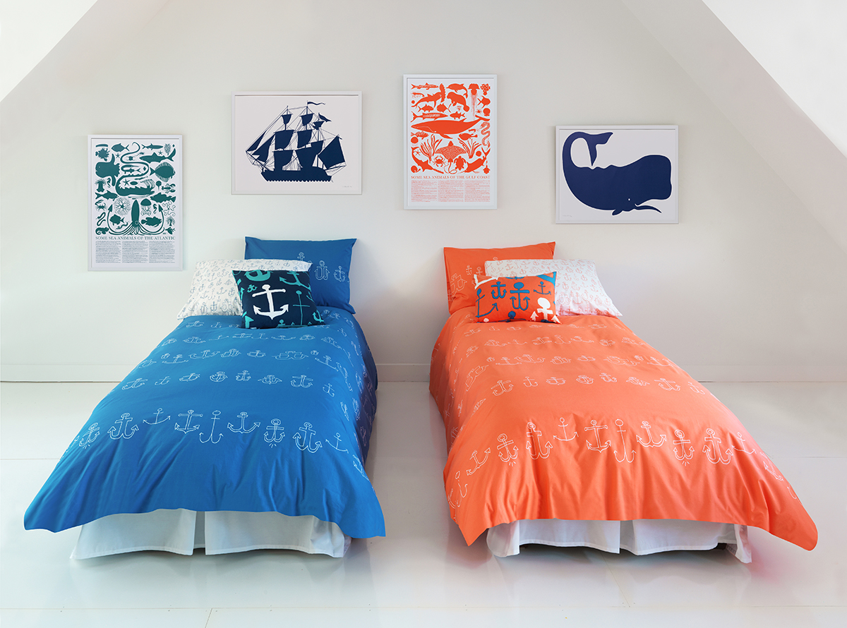
To get things kicked off this year Robert wanted to add a spark of light to our Spring Collection so he chose the invigorating color coral. We’ve never had a big range of orange tones here at Unison, but this season it just seemed right (along with the introduction of peach too). Combined with blue, this new hue plays really well. Dive right in!


The style watch team at Apartment Therapy thinks coral red is tops as well for 2015. It’s one of their “9 Biggest Style Trends for 2015”.
Do you like this color? Let us know, love it or hate it, in comments section below.
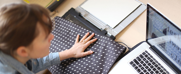

I met Chicago-based artist Alex Chitty this past summer during a visit to her studio with the Chicago Printmaker’s Guild. She spoke to us about her recent photographic explorations and constant effort to add new technical processes (ceramics, woodworking, electroplating metals…. you name it) to her studio practice. Alex’s interest in modes of display and domestic, utilitarian forms immediately got me thinking about a collaboration with Unison, and now one is in the works!
Alex has selected domestic goods from Unison’s spring collection to alter, deconstruct, and reinstall in photographic and sculptural compositions that reference, but are removed from, their original utility. Last weekend, Alex came to the Unison store in Wicker Park, equipped with her flatbed scanner and camera, to document textures, patterns, and objects for use in her project.
At Unison, we always want to learn more about the process and thinking behind an artist’s work. Alex has kindly taken the time to tell us a bit about her use of scanning and digital manipulation:
“In place of a camera, I frequently use my laptop and a cordless flatbed scanner. As the scanner translates 3D analog into digital, it invents information and reveals images that hint at an original source without revealing it. This becomes important conceptually as well as aesthetically: a document of the history of its own making links itself to painting, cinematography, dance and performance. Another misused tool is Adobe Photoshop — software designed to covertly enhance or shift the reality of an image. When used to make obvious additions and changes by adding text and symbols or blurring specific areas, the tool becomes conceptual not functional. The resulting image disappoints the anticipated expectation of reality and begins to reveal how we see and think when looking at photographic imagery.”
“I use Photoshop intermittently, so you are never quite sure what exactly you are looking at, and in this way, you are encouraged to think about the actual act of seeing. Essentially, it’s meant to slow you down and make you a tiny bit self-conscious of your existence in the world, like when you see your reflection in a shop window as you walk by, and you remember ‘Oh, yeah…I’m a human body, walking down the street’.”
The Unison team is bursting with excitement to see how Alex will transform Unison products, using them as materials in her new project. We hope you will join us for the opening reception to see the work and meet Alex!
– Kim Morski, Curator for the Alex Chitty + Unison collaboration and Domestic Production Manager at Unison

Learn more about Alex Chitty and her artwork at www.alexchitty.com
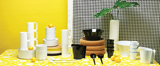
With the ringing in of a new year, Robert & I are making some style resolutions for the coming seasons. 3 resolutions, to be exact. (Why not keep it manageable?)
Each of these style goals for the new year is based on what we’ve learned (or re-learned) last year, and we’d like to share them with all of you – and ask you to share your own with us as well!
When it comes to pattern, our tendency has long been to keep things pretty matchy-matchy. But all that’s changing, thanks not only to how the use of pattern has evolved in our own lives and home, but also to how we’ve seen others buy, combine, and live with Unison products. In the end, we’ve learned that combining and contrasting pattern can be more fun and freeing. So we’re resolving to mix it up more than ever this year.
One key tip for making this work in your own pad: vary the scale of patterns. If you’re picking 3 patterned throw pillows to combine (a great number), go for 1 small scale pattern, 1 medium scale, and 1 large scale. Your patterns will play much more nicely together if they’re not competing on the size front.
We are still white paint fanatics at home, but bringing color backgrounds onto our photo shoots has definitely created some strong vibes for bold wall color. I doubt we would ever do a whole room, but we have resolved to get into the accent wall, wherever fitting.
A single wall in cobalt blue or pale pink can take a room from fine to fabulous. The trick is using quality paint so that the color shows beautifully and will stand the test of time.
Even for a quick breakfast at home, we still set out napkins, the necessary flatware, glassware, and plates. We think it’s of the utmost importance to not only eat together – sharing conversation and face time – but to create a very simple, properly set table when doing so.
If you do this every day, you’ll soon find yourself going a bit further, using place mats or tablecloths and candles at dinner. Bon appétit!
Do you have any style resolutions of your own? We’d love to hear about them in the comments area below.
Happy New Year!
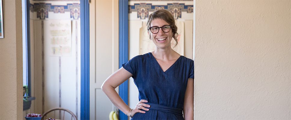
When artist, painter and printmaker Hillery Sproatt cropped up on our radar, we knew our holiday season was going to be so much brighter. Hillery’s paintings, which speak to her innate sense of
color and pattern, inspired our latest Harvest collection. Going back to the basics in black and white, the modern folk-like design is featured on table linens, throw pillows and knit
blankets — creating a bounty of pattern wherever you need it. Enjoy cocktails featuring apple brandy from local distillery Rhine Hall.
This Thursday from 6-8pm and spend an evening chatting with Hillery, browse some of her original artwork and enjoy 20% off all Harvest items during the event at the store at 1911 W Division Street.

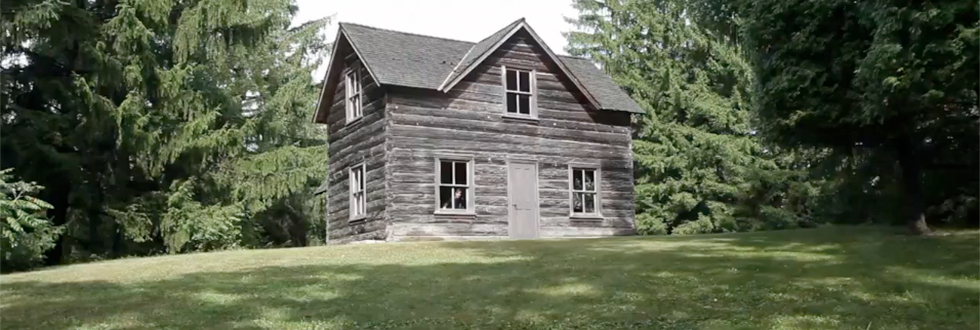
Part of this year’s holiday photo shoot took place at our family farm in Wisconsin where Robert spent much of his childhood running around amongst pine forests, taking sauna and feeding the animals in the barn. On the hill is an original cabin brought in from the northern woods that was once home to a family from Sweden. It’s a place full of history and steeped in Scandinavian simplicity. We took along Chicago-based photographer and filmmaker John Sturdy to shoot a little behind the scenes. Here is the result, set to the beautiful music of The Lesser Birds of Paradise.
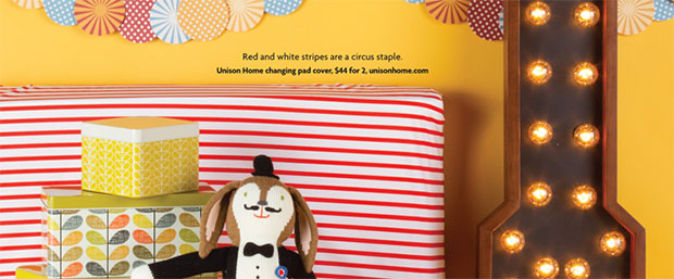
We are delighted to see our Sailor Poppy Changer Cover featured in this month’s issue of Pregnancy & Newborn! Selected as part of their Circus theme, under Six Nursery Themes You’ll Love.
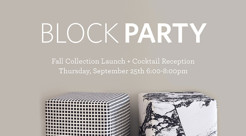
Join us for our first event of fall to celebrate the launch of our fall collection! We are calling interior designers, architects, loyalists and newbies for a cocktail event featuring our Fall collection and limited edition upholstered furniture pieces. Learn about other creative uses for our fabrics and take 20% off our entire collection. Enjoy cocktails and samples featuring apple brandy from local distillery Rhine Hall. Feel free to rsvp to our Facebook event or to division@unisonhome.com. Thursday, September 25th from 6-8pm at Unison, 1911 W Division St, Chicago.