jamie_tubbs

#ArtinUnison: Jamie Tubbs + Prophet Gypsy Robot

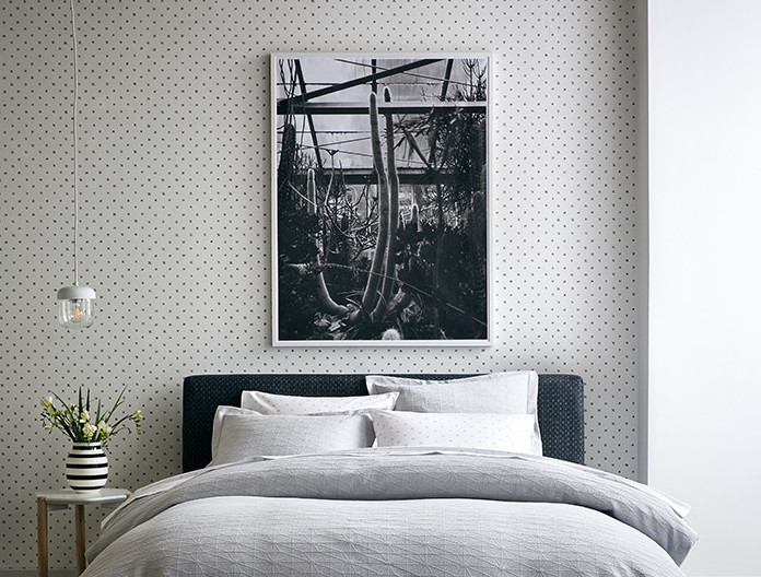
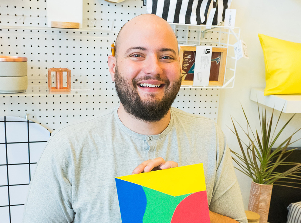
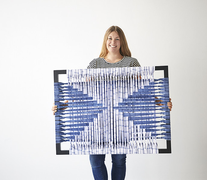
We at Unison have been big fans of Jamie Tubbs and her company Prophet Gypsy Robot. Her focus on creating fiber tapestries through sustainable practices led us to work with her on a recent catalog, where we featured one of her weavings. It caused such a stir among our customers, we knew we had to partner with her on a set of unique pieces.


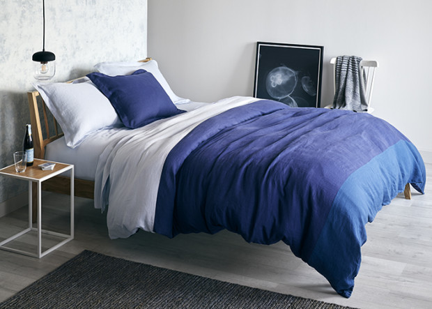
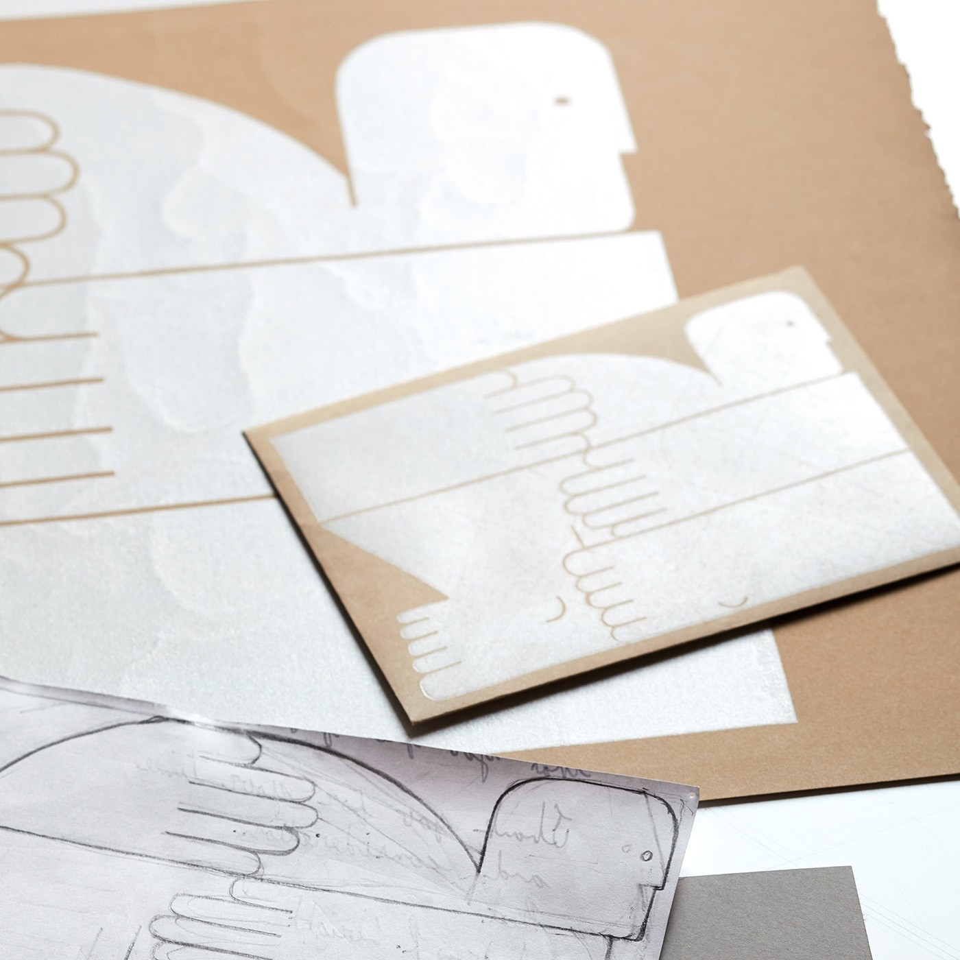
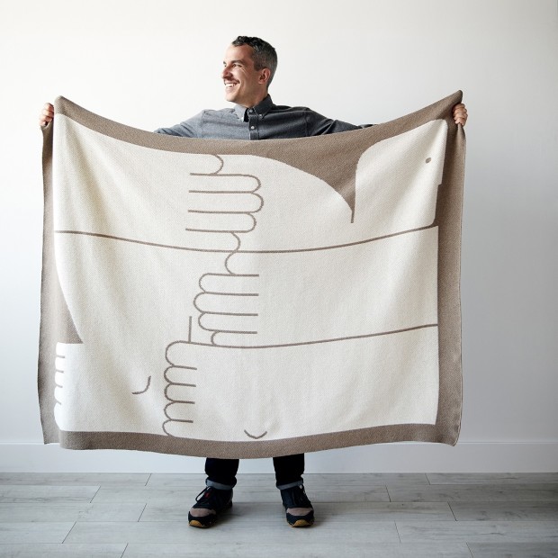
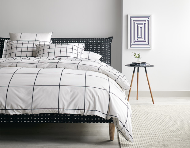
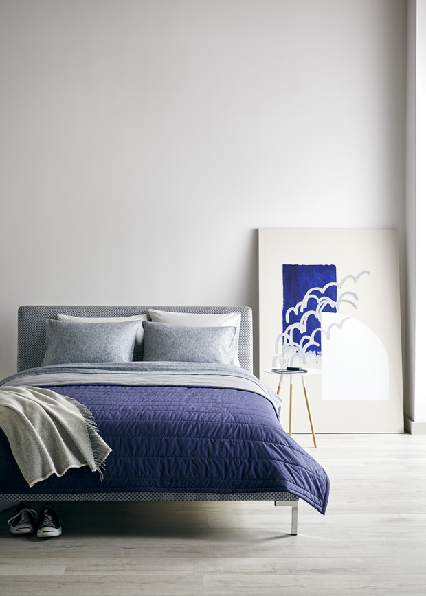
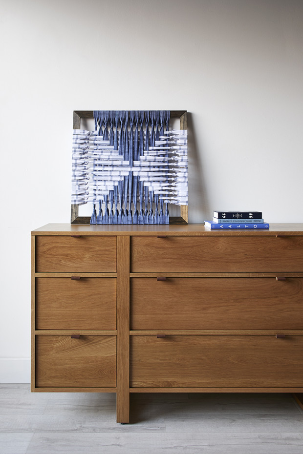
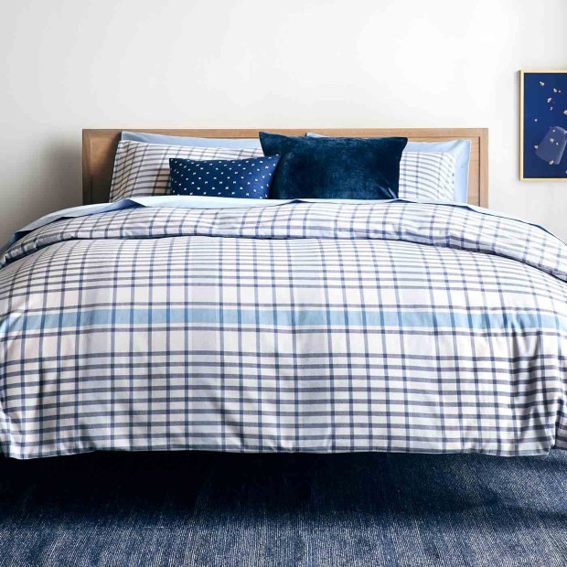
The Humboldt Framed Weavings repurpose post-production scrap fabric from our signature Humboldt bedding for a piece of sustainably sourced artwork with a modern edge. They’re available in 24″ x 24″ and 40″ x 30″.
We asked Jamie some questions for this month’s #ArtinUnison to learn more about her, her process, and her collaboration with Unison.


Q: What interested you in working with Unison cuttings? You say on your site you like to create art with a specific environment in mind. Did you have one in mind while working on this collaboration? 

A: I could never pass up a well suited opportunity to take some waste from production and create something beautiful and new out of it. This design was inspired by the natural materials, clean lines and graphic pops in the environments in Unison’s catalogs.

Q: What is unique about this collaboration? 
A: I don’t think it’s common for manufacturers to reach out to artists in order to explore ways to recycle unavoidable waste, but I think it’s what the future needs to look like. Designers need to be showing the world that reuse can be aesthetically valuable, in addition to necessary. Working together, we’re able to offer people a way to design their homes with original art that’s also reducing waste.


Q: What would you say are signatures of your work?
A: Large scale, sustainable textiles, woven and hung on the loom. Or at least that’s what’s in my constantly evolving Instagram profile right now. This would be such an interesting question for me to ask others actually! I’m not sure if this is a signature or if every artist feels this way, but I have to experiment and do things differently or it feels inauthentic and unnecessary.
Humboldt Weaving in process

Q: What is your process for weaving? 

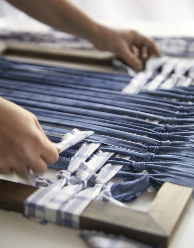
A: My husband Nate and I build my looms with a miter saw in our garage, mainly from pine or oak or reclaimed lumber. I’d like to get into other materials like maple, ash and copper. I sell most of my work on the loom itself. When I started weaving, I did it this way to bring attention to the work/worker and bring the feeling of a work in progress. I continued to do it this way both to carry that story in my work as well as for aesthetics.

I’m always looking for textures and ways to manipulate the materials I have on hand to make them look new and fresh. I’m usually experimenting with a new stitch or technique or design idea. My entire weaving education has been the work itself. I got the idea to hand dye bedsheets and weave them, hanging it unfinished in the loom with the shuttle. I executed that idea a few years ago and just never stopped weaving.
Q: What particularly inspired your passion for sustainable art?
A: It’s a cultural value for me to use what I have. So, I came to it first because of the practicality. My mom and dad, their parents, and so on- blue collar folks who know how to make what they need out of what they have. I have an aversion to wastefulness. It just feels like common sense to me. I’ve had to learn the opposite, in fact- that sometimes good design isn’t utterly practical. So my work tries to combine both. I buy new rope, for example, because I don’t know how to find it used and I think it’s just beautiful and elevates the repurposed materials in my work.


My passion for caring for the environment has developed in the last few years from a million little things I saw or heard or read. One that sticks out to me was a documentary about American history that talked about how the native people lived for hundreds or thousands of years off the same buffalo herds, and when European settlers came to the West, they eliminated the herds in 3 generations manufacturing belts and stuff. Heartbreaking, avoidable, and motivating.


Follow Jamie on Instagram @prophetgypsyrobot
debbie_carlos

#ArtinUnison: Debbie Carlos

We at Unison counted ourselves lucky this year to be able to feature the striking photography of Debbie Carlos in our Fall 2017 catalog. This month’s #ArtinUnison highlights her photographs, along with a Q+A involving her artistic influences, favorite places to capture, and her true opinions on jellyfish.


Q: Your site talks about your quest to “capturing objects at their moments of greatest clarity” — do you have any particular environments you find work best for that?

A: I find that my senses are the most heightened when I’m traveling. Being in a new environment I’m hyper aware of everything going on around me, and I try to take it all in and capture as many moments as I can in my camera.

Q: One of the photographs we featured in our fall catalog was of jellyfish — what was striking about that moment to you that you wanted to capture it?

A: It’s hard not to be enthralled by the strange forms of jellyfish. They are blobby creatures, ethereal & ghostlike in the way they are lit at the aquarium, and sort of elegant in the way they float through the water.

Debbie Carlos Jellyfish Photograph - Unison colorblock bedding
Linen Colorblock Duvet, Acorn Black & Copper Pendant Lamp, Tower White Side Table


Q:
 Who are some of your greatest influences?

A: Rinko Kawauchi and Uta Barth have always been a huge influence on my art. Their work always strikes an emotional chord in me.

I remember going to a William Eggleston a number of years ago at the Art Institute of Chicago and felt like it was so validating.

More recently, I have become a huge fan Teju Cole’s words and images. His instagram is definitely worth a follow and his book of photographs and essays, ‘Blind Spot’ is wonderful.

Q: What is your favorite place to photograph?

A: Japan never fails to be pure eye candy to me.

Q: How does modernism reflect itself in your work (if you think it does)?

A: I do think that there is a strong modernist bent to my work, not only aesthetically but conceptually. One of the things that has always stuck with me was Eames’ mantra “Create the best for the most for the least”. I loved how democratic that idea is and was very much a part of modernist concepts of accessibility to design. Art should not just for those who have the money to afford it, but should be approachable to many. In terms of my photographic work, this is the reason why I re-appropriated engineering printers to produce many of my images. I was re-appropriating a type of utilitarian printing for fine art and thereby creating, on one hand, it’s own unique aesthetic but on the other, casual and approachable everyday art for everyone.


You can find more of Debbie Carlos’s work on her site at Debbie Carlos Studio, or on her Instagram @debbiecarlos.


download-13

#ArtinUnison: Andrew R. Wright

One of our key values at Unison is collaboration with independent artists that share our passion for modern living. Working with illustrator and printmaker Andrew R. Wright was therefore a clear must for us. Andrew’s work has appeared in The Wall Street Journal, Wired, and The Saturday Evening Post. We knew the perfect Unison/Wright project would take his simplified but inviting forms and turn them into the Dove Natural Knit Blanket.
download-10

We sat down with Andrew to get deeper into what inspires him, how he works, and, of course, what his process was for developing one of our favorite products of the 2017 Unison Holiday Collection.

1. What are some key trademarks of your work?

For quite some time this was the only question that mattered to me. In a way it plagued me. I was impatiently searching for that one “thing” that would define my work and make all of the Art Directors I wanted to work with say “We need Andrew R. Wright for that!” In a way I found it with texture, shape, and gradients achieved through a mixture of printmaking techniques (mostly monotypes and block printing). But, I was miserable [because I felt stuck in one way of working]. Now, I’ve gone down a path of not trying to define what I want my work to look like, i.e. trademark. It’s an ethos that doesn’t get me a ton of illustration jobs but I feel that I can sustain a healthy output of work that I’m genuinely proud of.

Now I let the work find its own trademark and try not to fret over whether or not it feels like an Andrew R. Wright, because ultimately it will. After all, I’m the one who made it.

envelope1

2. What about your style aligns with Unison?
Much of my inspiration comes from design. The Weiner Werkstatte, Ver Sacrum, Dieter Rams, Mies van der Rohe, and Ben Shahn. While there are exceptions within each of the groups and people listed, to me the majority of their works are about simplification of ideas presented in a way that immediately reads. Simple, but not boring. Graphic, but not cold. Immediate, but not messy.  That to me is exciting. That to me is what I love about the collections that Unison puts out. The collections have an elegant simplicity, pared down to necessary but beautiful form and function.

3. What appeals to you about simplified or minimalist forms?

This answer will slightly overlap with the previous. It’s mostly about getting rid of all the stuff that does not matter to the core of the idea. Both in art and in life. I think this came from living in my first small apartment 6 years ago, having to be almost spartan-like with organization, which also lined up to my beginning obsession with Dieter Rams. I’m a firm believer that being an artist is not just producing images but also a lifestyle. Furniture is analyzed in the same way that composition is thought out. Color palettes can be seen just as quickly in a diner as they are in a series of color studies. It’s not something that gets turned on and off. It’s a constant (that can be incredibly annoying!).


toucan

4. How would you describe your process?

Be it my new curiosity with paper mache sculptures or a simple menu for a dinner party, everything starts with writing and thumbnail sketches. Sometimes it’s one sentence and one thumbnail. Other times it’s a novel’s worth of writing and 10 pages of drawings. I can never really tell how an idea will solve itself. The rest of the process will vary depending on what the final piece is.

I will outline my process for block prints, which is what the Dove Blanket was produced from:
From the rough drawings and writing, I typically do a refined drawing depending on the work at hand. It then gets scanned and flipped to ready for transfer to a linoleum block. I cut one block per color depending on the image’s complexity. The drawing is transferred and the blocks are cut. I have a Takach table top etching press that is my lifesaver at this point. Layers are printed in order of lightest to darkest. There are a lot of intricacies within each of those steps but out of respect for anyone who has read this far, I’ll leave it at that.

5. What inspired the blanket’s design?
 Simplification was the main point. Big surprise, right? It came from a series of envelopes that I had been producing for various mailers to Art Directors. The series revolves around making figures fit in to a pre-defined shape with extreme simplification while still communicating the fact that they’re figures.
I have to hand it to Robert, Alicia, and Jamie for seeing the potential of that tiny piece translating so well into a 50 x 60 knit blanket. It’s one of my favorite things I’ve made to date!

See more of Andrew R. Wright’s work on his website, Andrew R. Wright, or on his Instagram, @AndrewRWright.

Chad Kouri at Unison Home Store

#ArtinUnison: Chad Kouri Talks Color, Minimalism, and Lena Horne

This month’s #ArtInUnison spotlight is on Chad Kouri. Chad’s artwork has been featured in the Unison catalog numerous times. His brilliant use of color and form caught our eye and we approached him to design some items for the Unison collection. We’re thrilled to be highlighting him this month.

Originally from Michigan, Chad lives and works in Chicago. He is an active participant in the Chicago arts community, and his work has been exhibited everywhere from San Francisco to Weimar, Germany. His Chicago exhibits include the Museum of Contemporary Art, The Hyde Park Art Center, and Johalla Projects.

Q: What are your favorite aspects of minimalism?

A: I love how something simple can be very profound. I have a quote from my high school band director running through my head often: “Simple isn’t easy.” That was more than 15 years ago, but it still means so much to me. I really respect a restrained and simplified presentation whether it’s music or performance or visual art. It’s so easy to just keep adding and adding. It takes a lot of courage to live with simplicity of any kind. I’m still working towards being more minimal, not only in my aesthetic but my lifestyle as well. It’s a lifelong practice!

chad_kouri_grid_art

Q: Your work is so incredibly colorful. Do you choose your colors mostly on instinct, or is it a very thought-out process.

A: I think a lot about color. What colors mean to us. How they are read and interpreted. How specific colors are present in our everyday lives. I’m constantly capturing photos, reviewing swatches and looking for color combinations or standalone hues that can be compelling and powerful. For example, I use yellow often in physical spaces and digitally as a visual palette cleanser when presenting my work. Even my print orders get shipped in a yellow bag. The goal is to simultaneously clear and focus your mind on what you are about to see. But all the color theory and thought is mostly in the background when it comes to the art-making process. One color typically leads me to another as I build compositions. I only use paint out of the tube or existing colored paper in my work, so as to not create something that feels unfamiliar and foreign. It’s further reassurance that my work can be in line with the world around us and not something that feels other-worldly.


Q: Who would you call your top 3 artistic influences?

A: Oh man…this is impossible to answer. I’m a minimalist in application but a maximalist in process so I’m looking at TONS of different stuff all the time. If I had to pick right now, I’d say I’m looking at a lot of work at the intersection of non-traditional photography and architecture right now. Erin O’Keefe and George Byrne come to mind. But any artist that is unapologetically themselves really draws me in. I feel this happening in music more than anything else. Thelonious Monk, Lena Horne, and George Clinton are fierce historical examples of this, but recently Chicago’s South Side singers and MCs are doing it for me. Chance the Rapper, Jamila Woods, NoName, to name a few. Of course, I’m looking at masterworks often as well… Ellsworth Kelly, Josef and Anni Albers, Bridget Riley, Sol Lewitt, Ettore Sottsass, Carmen Herrera, McArthur Binion and Ray and Charles Eames to name a few.

chad_kouri_blue

Q: You’ve cited jazz as being a part of your work — how does that tend to show up in your pieces?

A: In all sorts of ways, honestly. Most directly, I have a body of work I call Jazz Movement Studies which started a little under ten years ago. These works act as graphic glyph-like representations of sounds I hear at Avant-Garde and Free Jazz sets that I frequent in Chicago. Growing up playing alto saxophone, I was very familiar with jazz standards that most people know. When I moved to Chicago, there was (and still is) this whole scene of people “playing out,” which means playing sounds that are outside of the traditional tonal structures of a song. Making this work helped me digest and find comfort in the dissonant sounds I was hearing in clubs and on records that friends were suggesting. Now, for me, that kind of music almost has a medicinal property.

Outside of that, I relate my entire practice to that of a jazz musician. I develop and collect a toolbox of colors, reference images, compositions, and concepts—just as a jazz musician collects melodies, scales, and chord processions. When it’s my turn to make something new, I chop everything up and assemble something from the pieces. It just happens to be a visual composition rather than an improvised solo.  

Q: What about your style aligns with the Unison brand?

A: I appreciate that Unison’s overall simple and color-driven catalog of objects don’t need to be screaming in order to get your attention. There is also a sophisticated playfulness to Unison’s aesthetic that I admire. We are obviously looking at some of the same stewards of our practice and share a common goal in finding an aesthetic that is both modern and timeless.

Find out more about Chad on his website, and stay tuned for more #ArtinUnison features!