

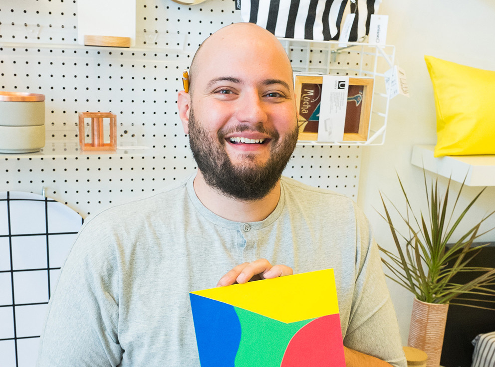
This month’s #ArtInUnison spotlight is on Chad Kouri. Chad’s artwork has been featured in the Unison catalog numerous times. His brilliant use of color and form caught our eye and we approached him to design some items for the Unison collection. We’re thrilled to be highlighting him this month.
Originally from Michigan, Chad lives and works in Chicago. He is an active participant in the Chicago arts community, and his work has been exhibited everywhere from San Francisco to Weimar, Germany. His Chicago exhibits include the Museum of Contemporary Art, The Hyde Park Art Center, and Johalla Projects.
Q: What are your favorite aspects of minimalism?
A: I love how something simple can be very profound. I have a quote from my high school band director running through my head often: “Simple isn’t easy.” That was more than 15 years ago, but it still means so much to me. I really respect a restrained and simplified presentation whether it’s music or performance or visual art. It’s so easy to just keep adding and adding. It takes a lot of courage to live with simplicity of any kind. I’m still working towards being more minimal, not only in my aesthetic but my lifestyle as well. It’s a lifelong practice!
Q: Your work is so incredibly colorful. Do you choose your colors mostly on instinct, or is it a very thought-out process.
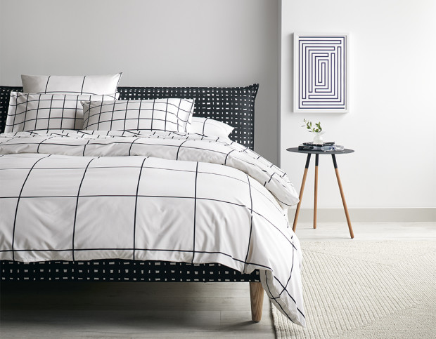
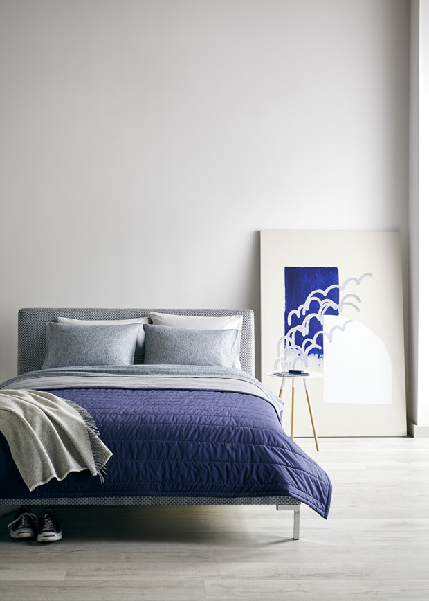
A: I think a lot about color. What colors mean to us. How they are read and interpreted. How specific colors are present in our everyday lives. I’m constantly capturing photos, reviewing swatches and looking for color combinations or standalone hues that can be compelling and powerful. For example, I use yellow often in physical spaces and digitally as a visual palette cleanser when presenting my work. Even my print orders get shipped in a yellow bag. The goal is to simultaneously clear and focus your mind on what you are about to see. But all the color theory and thought is mostly in the background when it comes to the art-making process. One color typically leads me to another as I build compositions. I only use paint out of the tube or existing colored paper in my work, so as to not create something that feels unfamiliar and foreign. It’s further reassurance that my work can be in line with the world around us and not something that feels other-worldly.
Q: Who would you call your top 3 artistic influences?
A: Oh man…this is impossible to answer. I’m a minimalist in application but a maximalist in process so I’m looking at TONS of different stuff all the time. If I had to pick right now, I’d say I’m looking at a lot of work at the intersection of non-traditional photography and architecture right now. Erin O’Keefe and George Byrne come to mind. But any artist that is unapologetically themselves really draws me in. I feel this happening in music more than anything else. Thelonious Monk, Lena Horne, and George Clinton are fierce historical examples of this, but recently Chicago’s South Side singers and MCs are doing it for me. Chance the Rapper, Jamila Woods, NoName, to name a few. Of course, I’m looking at masterworks often as well… Ellsworth Kelly, Josef and Anni Albers, Bridget Riley, Sol Lewitt, Ettore Sottsass, Carmen Herrera, McArthur Binion and Ray and Charles Eames to name a few.
Q: You’ve cited jazz as being a part of your work — how does that tend to show up in your pieces?
A: In all sorts of ways, honestly. Most directly, I have a body of work I call Jazz Movement Studies which started a little under ten years ago. These works act as graphic glyph-like representations of sounds I hear at Avant-Garde and Free Jazz sets that I frequent in Chicago. Growing up playing alto saxophone, I was very familiar with jazz standards that most people know. When I moved to Chicago, there was (and still is) this whole scene of people “playing out,” which means playing sounds that are outside of the traditional tonal structures of a song. Making this work helped me digest and find comfort in the dissonant sounds I was hearing in clubs and on records that friends were suggesting. Now, for me, that kind of music almost has a medicinal property.
Outside of that, I relate my entire practice to that of a jazz musician. I develop and collect a toolbox of colors, reference images, compositions, and concepts—just as a jazz musician collects melodies, scales, and chord processions. When it’s my turn to make something new, I chop everything up and assemble something from the pieces. It just happens to be a visual composition rather than an improvised solo.
Q: What about your style aligns with the Unison brand?
A: I appreciate that Unison’s overall simple and color-driven catalog of objects don’t need to be screaming in order to get your attention. There is also a sophisticated playfulness to Unison’s aesthetic that I admire. We are obviously looking at some of the same stewards of our practice and share a common goal in finding an aesthetic that is both modern and timeless.
Find out more about Chad on his website, and stay tuned for more #ArtinUnison features!